

Mega Menus on ESP+ Websites enable you to enhance your website navigation with large, structured dropdown menus. Instead of simple link lists, Mega Menus can include multiple columns of images, links, buttons, text, and tiles to help visitors find products faster and improving the overall browsing experience.
Mega Menus are managed directly within the website admin and do not require custom development or coding.
Add a Mega Menu
Step 1: Open the ESP+ Website Editor
Log in to ESP+ and select Websites from the main toolbar.

Locate the website you would like to update and click on the thumbnail.
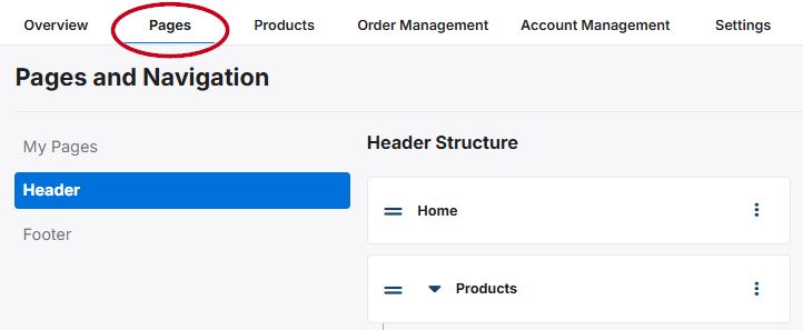
Step 2: Access the Header Navigation
Go to the Pages section and select Header from the options on the left.
Step 3: Add a Mega Menu
Choose an existing navigation label, link, or page to which you would like to apply the Mega Menu. Click on the three-dot icon and select "Add Mega Menu".
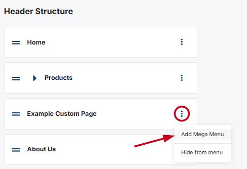
It is important to note that Mega Menus cannot be added to navigation items that have nested links, nor added to the nested items themselves.
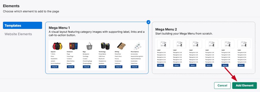
Step 4: Choose a Layout
Select one of the available options from the Templates section:
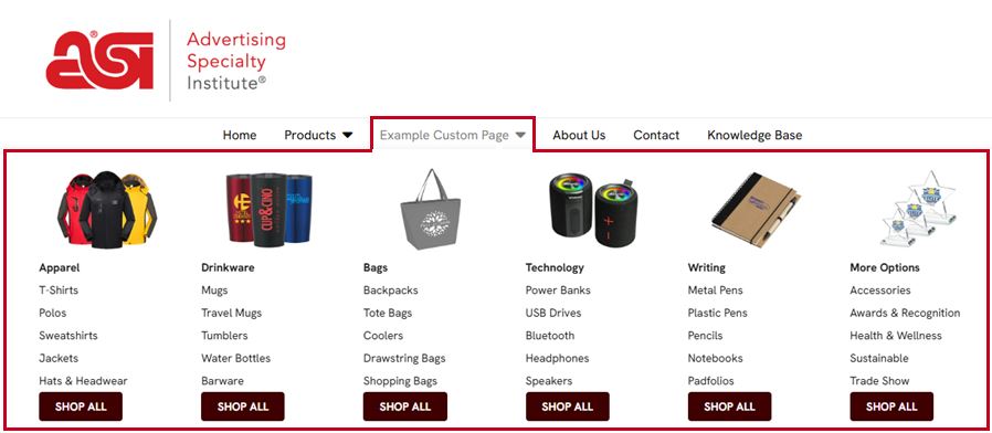
- Mega Menu 1: Prebuilt template with images and preset links to saved product searches to direct visitors to relevant product results.
- Mega Menu 2: Blank template for full customization.
Click on the element you would like to use and then click on the "Add Element" button.
Step 5: Add/Update Menu Columns and Elements
Mega Menus are built using modular components which enables you to update specific sections without rebuilding the entire menu. You can add up to five (5) elements per menu column with up to six (6) columns per menu. The element options are:
It is important to keep in mind that deleting a column will remove the image, links, and buttons completely. If the deleted column is added back to the Mega Menu, you will need to customize it. Also, changes are not visible to visitors until the site is published.
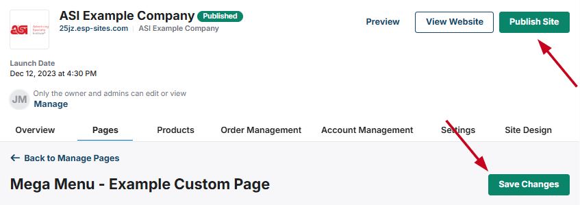
Step 6: Save and Publish
When you are finished configuring and updating the columns and elements within the Mega Menu, click on the "Save Changes" button. Then, use the preview to ensure the Mega Menu is displaying and functioning properly. When you are ready, click on the "Publish" button.
How to Update Mega Menu Columns and Elements
Each section of the Mega Menu is contained within a column and can contain multiple elements.
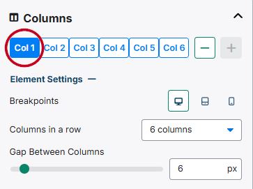
Manage Columns
Within each column, users can add supported content elements—such as navigation links, images, and buttons—to guide visitors through key areas of the site. This component-based approach allows distributors to update navigation content without rebuilding the entire menu structure.
A single mega menu can support up to six individual columns, allowing for complex layouts that accommodate large navigation sets or mixed content types. Changes made at the column level affect how all nested elements are displayed together within the mega menu.
The content for each column can be accessed by clicking on the column number. Use the "-" and "+" buttons to remove or add buttons.
Element Settings
Expanding the "Element Settings" section will enable you optimize the column settings themselves. The first option, Breakpoints, enables you to optimize the column display for a standard monitor, a tablet, and a phone. Clicking on each icon will change the "Columns in a row" amount to display best on that device, but can be updated using the drop-down.
The third option in this section is the "Gap Between Columns" slider which enables you to increase or decrease the spacing between columns in each row.
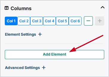
Add An Element
Click on the "+Add Element" button to open the Elements window. Then, select the element you would like to include in the Mega Menu and then click on the “Add Element” button.
Image
Use the arrow to expand the image section. There are two options: Content and Styles.
Content
To change the picture for the column, click on the trash can icon. Then, click on the “Choose Image to Upload” button to browse your computer for the image or click on the “Select from Library” button to choose an image from the Asset Library. You can also drag and drop an image to the available box.
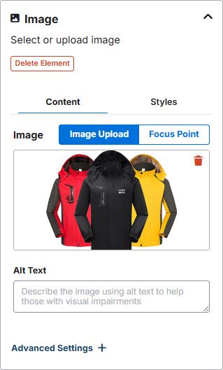
After the image has been uploaded, use the "Focus Point" option to direct the focus and zoom for the image.
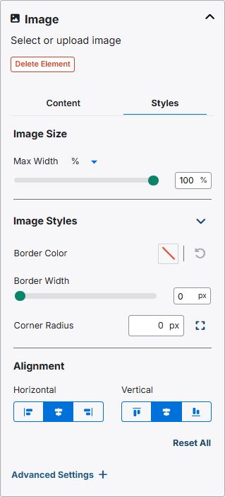
Styles
The styles section enables you to customize the image settings within the column. The first option is to the option to select an image unit and update the size.
Next, you are able to use the "Image Styles" options to add and configure a border, as well as use the Corner Radius to curve the corners of the image.
In the "Alignment" section, you can align the column horizontally as well as vertically.
Navigation
The navigation enables you to set links to specific pages, links, or predefined searches in the Mega Menu. Use the arrow to expand the navigation section. There are two options: Content and Design.
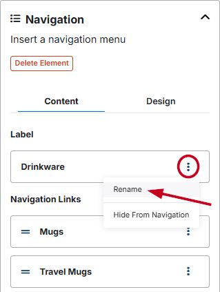
Content
The content section enables you to update, add, and redirect the label and navigation links within the menu. To update a label or navigation link, click on the three-dot icon and select the "Rename" option.
If you would like to have the links displayed without a label, select "Hide From Navigation" from the drop-down.
This will open the label where you can update the label title, as well as direct visitors to your site to a specific page on your ESP+ Website or specific page or website. You can also use the slider to open the link in a new tab. When you are finished, click on the "Save" button.
In the Navigation Links section, the drop-down options will also provide the option to duplicate or delete a navigation link. The links in this section also contain a two line icon which will enable you to reorganize the link order by dragging and dropping.
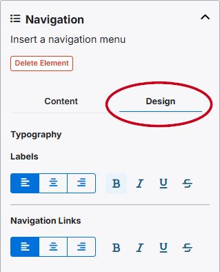
Design
The design section enables you to modify the typography for the label and the navigation links.
Button
This section enables you to add custom button to the Mega Menu. Use the arrow to expand the section. There are two options: Content and Design.
Content
The content area enables you to update the text as well as direct visitors to your site to a specific page on your ESP+ Website or specific page or website. You can also use the slider to open the link in a new tab.
Design
The design section is where you can style the button, set the size, alignment, and margins.
Text Box
The text box will enable you to configure the text as needed within the column. Use the options available on the toolbar to modify the appearance of the text.
Tiles
You will be able to configure up to four (4) tiles within the menu. To update the image, click on the “Choose Image to Upload” button to browse your computer for the image or click on the “Select from Library” button to choose an image from the Asset Library. You can also drag and drop an image to the available box.
Next, enter alt text for the tile image. Alt Text provides browsers with a short description of the image and can be read by screen reader software.
After the image has been uploaded, use the "Focus Point" option to direct the focus and zoom for the image.
Then, enter a header for the tile and select the destination when visitors click on the tile: an existing page on your ESP+ Website or to a new website. Set the designation for the link and choose whether this page or link should open in a new tab. If you wanted a tile image to serve as a standalone image, upload the image and add the alt text, but then leave the header and destination fields blank.
When you have finished configuring the first time, click on the “Add Another Tile” button to configure additional tiles for this element. The size and shape of the tiles will update automatically readjust to fit within the width of the column.